When conducting research on whether something is working or not, answers cannot always be given as a simple yes or no. Time may also be a relevant factor. If you are producing light bulbs, you are not only interested in whether it works, but also how long it lasts. A certain cancer drug might prolong patients’ lives, although not cure the patient. So how do you measure the success of the light bulb and the cancer drug? This is when survival analyses are needed. Also called time-to-event analyses, these statistical methods account for how fast an event happens, in addition to whether the event happens at all.
What are survival analyses?
The term survival analysis can be a bit misleading, as it does not necessarily have anything to do with life and death. It can be relevant for any research question where time is a relevant factor. Interestingly, this type of analysis can have different nicknames in separate industries, which together help illustrate what the analyses can be used for:
Medicine: Survival analysis (Examples: Death, progression, disease onset, hospitalization)
Social sciences: Time-to-event analysis (Examples: Marriage, divorce, graduation, first job after studies)
Engineering: Failure-time-analysis (Examples: Light bulb burns out, phone battery dies, computer program crashes)
When is a survival analysis appropriate?
So, why can’t one simply count the events in two or more groups with different exposures or baseline features, and compare the resulting proportions?
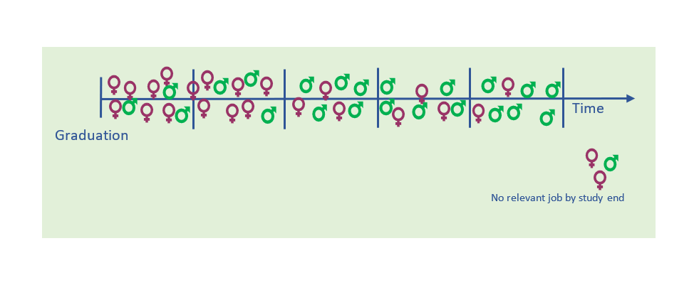
Imagine you have a group of college graduates, and you want to investigate whether males or females are most likely to get a study-relevant job. In doing so, you can decide whether you want to determine this at fixed intervals, i.e., during the first 12 months, the first two or the first five years after graduation.
Then imagine that you choose to look only at the five-year mark. You find that 91% of the girls and 96% of the boys have landed a relevant job by that time, indicating that employment rates are pretty similar. But when you look at the two-year mark, you find that the respective percentages are 58% and 25%; i.e., not so similar at all. This indicates that it takes the male students longer to find a relevant job, and you want to look closer into how big this difference really is. Hence, you need an analysis that accounts for both whether they land a relevant job, as well as when it happens.
Hazard ratio versus risk ratio
A straightforward, easy interpretable statistical analysis is the risk ratio, or relative risk:
Risk ratio = Risk of event in group 1 / Risk of event in group 2
In the example of the college graduates, the “risk” – which in this case could actually be defined as a success, but the same analysis terms apply – of a female to have a job at study end, is 0.91, while the risk for males at the same time is 0.96. Hence, the risk ratio is 0.91 / 0.96 = 0,95, meaning that the two groups have pretty similar chances of being employed after five years. However, if the study was stopped after two years, the picture would look very different: 0.58 / 0.25 = 2.32, which would mean that the risk – or chance – of a female to be employed after two years, is more than two times higher.
In summary, the risk ratio or relative risk describes all observations and events regardless of when they occur. But sometimes, we need to describe the observations differently, as the timing of events during the observation period can be very relevant. Also, the observation time may be different for individual subjects, in which case a relative risk analysis would force us to perform the analysis at the occurrence of the first loss to follow up. To handle these issues, we instead calculate a hazard ratio.
The hazard ratio can be defined as: (Risk of event in group 1 / time unit) / (Risk of event in group 2 / time unit)
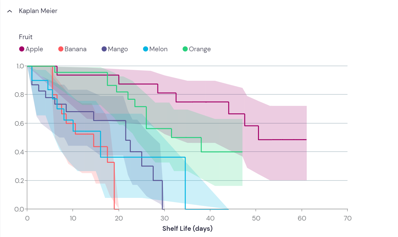
The analysis divides time into indefinite small intervals, and the resulting Hazard ratio is a measure of all the individual snapshot probabilities during the whole study period. This is best illustrated by the Kaplan-Meier plot (see below), where the probability of “survival” is plotted against time.
Censoring: When the event of interest does not occur
Survival analyses measure and compare the time to an event of interest. However, this event might never happen for some of the study subjects. Also, some events might not happen until after the study ends, or study subjects could need to be excluded due to withdrawal or other events. For example, a patient might be excluded from a clinical study due to side-effects, a light bulb might be excluded from a durability study if it falls on the floor and breaks, and so on. When this happens, the subject of study is removed from the study without any experiencing event. Hence, the “true” time to event for these subjects remain unknown. Censoring is one important reason why simple statistic methods like comparing proportions cannot be used.
How to prepare the data
Before performing a survival analysis, it is important to have a clear definition of what the event of interest is, and how to define it. Second, it needs to be defined when the observation time starts, and when it ends.
The following needs to be recorded for each study subject to perform a survival analysis:
- The time variable (follow-up)
- Status at the last observation: event or censored (often coded as 1 and 0, respectively)
- A group assignment to enable comparison of groups
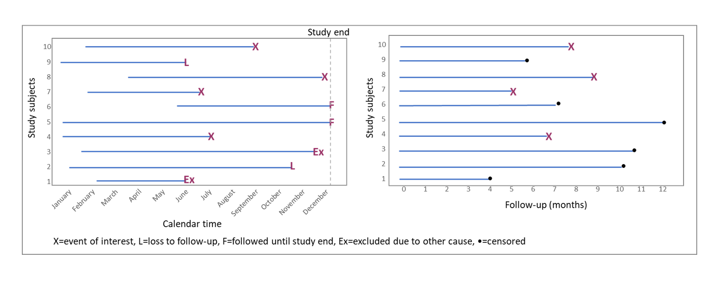
To create the time variable, calendar time needs to be converted to time units. This equals the time between time zero (start of study) and the end of observation, due to event occurrence, loss to follow-up, or study end; whichever comes first. The time variable is also known as follow-up time:
Follow-up time = End time point – Start time point.
This converts all study subjects’ timelines into a comparable format, regardless of when they were enrolled in the study (Figure 2).
The Kaplan-Meier plot
In the Kaplan-Meier plot, the proportion of “remaining” subjects (that has not experienced the event of interest) is plotted on the y axis, against time on the x axis. If survival is the main measure, then the event of interest would be death. Hence, the proportion of surviving subjects would be plotted over time, yielding a curve that will inevitably go towards zero. Similarly, if light bulb durability was the main measure, the event of interest would be light bulb burnout, and the graph would also go towards zero. However, this will not the case for all study questions. In the example with the college graduates above, some students may never find a relevant job. Then the curve will simply flatten out after the last recorded event.
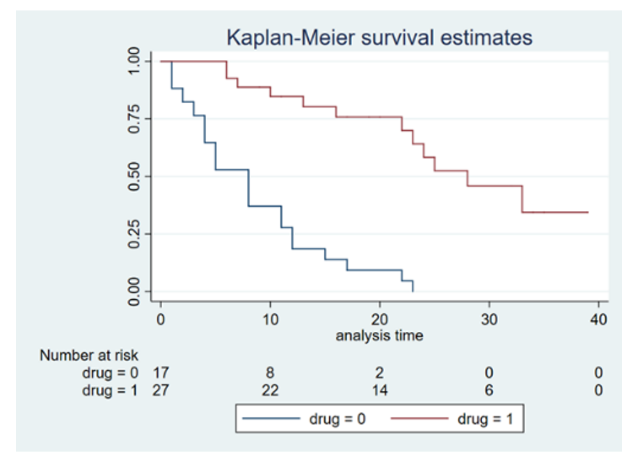
Comparison of groups from a Kaplan-Meier plot is rather intuitive. Events are likely to happen in all groups, given sufficient follow-up; but as can be seen on Figure 3, the rates may be different. Measures like median survival can be read directly from the plot; namely when the line crosses 0.5 (or 50%) on the y-axis.
The curves step down at each occurrence of an event. The hight of each step is influenced both by the number of events happening at that time, but also by censored events since the last step. This is because between events, some subjects may have been censored, leading to a change in the denominator of the surviving fraction (see Figure 4). Such changes in the surviving proportion due to censoring is not visualized on the graph until the next event occurs. However, statistical software packages often provide an option to visualize censoring as small, vertical lines on the horizontal parts of the curve.
Table 1: Simple example of how fractions are calculated, while accounting for censoring:
Time | Study subjects | Event(s) | Censored since last event | Remaing fraction | Remaining % |
Day 1 | 10 | 10/10 | 100,0 | ||
Day 2 | 10 | 10/10 | 100,0 | ||
Day 3 | 8 | 2 | 8/10 | 80,0 | |
Day 4 | 7 | 1 | 7/9 | 77,8* | |
Day 5 | 4 | 1 | 2 | 4/7 | 57,1 |
Day 6 | 4 | 4/7 | 57,1 | ||
Day 7 | 4 | 4/7 | 57,1 | ||
Day 8 | 3 | 1 | 3/7 | 42,9 | |
Day 9 | 3 | 3/7 | 42,9 | ||
Day 10 | 2 | 1 | 2/6 | 33,3* | |
Day 11 | 2 | 2/6 | 33,3* | ||
Day 12 | 0 | 1 | 1 | 0/5 | 0,0 |
* Will not appear in the plot, as censoring is not shown as individual steps.
The Kaplan-Meier survival analysis is a great method when comparing otherwise similar groups, as it can only compare one feature at a time. This makes it useful for comparing survival or progression in randomized trials, and other studies where confounding are not believed to be relevant (see pitfalls, below).
Statistical significance
Curves on a Kaplan-Meier plot is commonly compared using the log-rank test. This is a hypothesis test, which compare the survival distributions of the groups under study. The null hypothesis will be that there is no difference in the probability of an event occurring at any given time point. The log-rank test computes a p-value that indicates whether any difference in the survival curves is likely to be caused by chance or not. The test does not measure any difference size; this is provided by the hazard ratio. The two are often reported together.
Assumptions and pitfalls
To compare groups by Kaplan-Meier, there are some assumptions that must be met. First, any censoring must be unrelated to the event of interest. Also, the probability of event should be the same regardless of when a subject is enrolled in the study, and the probability of censoring needs to be similar across groups. In addition, the hazards in the groups under comparison should be fairly proportional.
There are some types of study where performing a Kaplan-Meier analysis will not be appropriate. Two very common reasons are:
- (Potential) confounding. As mentioned above, Kaplan-Meier graphs and the log rank test can only analyse one variable of interest. This means that the groups compared need to be otherwise similar. If this is not the case, one might likely over- or underestimate an effect of the variable under study. This due to other factors which can be related to both the variable and the outcome, and hence influence the likelihood of event. Such factors are commonly known as confounders. For example, smoking would likely be a confounder in an analysis between educational level and lung cancer. If smoking is not accounted for, the effect of educational level on the risk of lung cancer is likely to be overestimated. To include more than one variable in the analysis, a multivariate analysis is needed, i.e. a Cox regression.
- Scaled/continuous variables: As the Kaplan-Meier graphs compare groups, many continuous variables will need to be divided. This can be done by simply dichotomizing by median, or any other percentile(s), depending on how many groups one wishes to compare. Identifying which cut-offs generate the lowest p-values are commonly not recommended, as this may lead to issues related to multiple testing. Such artificial cut-offs will often be dataset dependent, reducing their utility in other datasets. Also, importantly, dividing continuous variables into categorical variables both leads to loss of information, and negatively influence statistical power. For such variables other methods, like the Cox proportional hazards modelling, will often be better suited.
More From Ledidi Academy


The difference between association, correlation and causation
- Statistical analysis
- Tips and insights