Brand & designguide
Version 0.1
Last updated 06.12.23
How the Ledidi brand is perceived is vital.
The way our brand is perceived shapes the very essence of Ledidi, and that's a realm we navigate with intention and purpose. Every word, all visual craft and our expertise is the core of Ledidi's identity. We communicate with clarity, a beacon cutting through the noise. Our tone is friendly but purposeful, reflecting the balance of approachability and expertise that defines Ledidi.
Communication platform
How the Ledidi brand is perceived is vital. It is in the brand and solution experience we create that reinforce our values and reveal who we are to the world. Lorem ipsum dolor sit amet, consectetur adipiscing elit, sed do eiusmod tempor incididunt ut labore et dolore magna aliqua.
01.
Vision & Mision
How the Ledidi brand is perceived is vital. It is in the brand and solution experience we create that reinforce our values and reveal who we are to the world. Lorem ipsum dolor sit amet, consectetur adipiscing elit, sed do eiusmod tempor incididunt ut labore et dolore magna aliqua. Ut enim ad minim veniam, quis nostrud exercitation ullamco laboris nisi ut aliquip ex ea commodo consequat. Duis aute irure dolor in reprehenderit in voluptate velit esse cillum dolore eu fugiat nulla pariatur. Excepteur sint occaecat cupidatat non proident, sunt in culpa qui officia deserunt mollit anim id est laborum.
02.
Tone of voice
How the Ledidi brand is perceived is vital. It is in the brand and solution experience we create that reinforce our values and reveal who we are to the world. Lorem ipsum dolor sit amet, consectetur adipiscing elit, sed do eiusmod tempor incididunt ut labore et dolore magna aliqua. Ut enim ad minim veniam, quis nostrud exercitation ullamco laboris nisi ut aliquip ex ea commodo consequat. Duis aute irure dolor in reprehenderit in voluptate velit esse cillum dolore eu fugiat nulla pariatur. Excepteur sint occaecat cupidatat non proident, sunt in culpa qui officia deserunt mollit anim id est laborum.
Ledidi logo
The Ledidi logo is our most important signature and should be used in all forms of communication. The logo symbol is developed based on the letter L. The symbol has a circle in the upper right corner, representing the core that is fundamental to our product. The core is consistent throughout the entire brand.
Primary logo
The main logo consists of a logo symbol and a wordmark placed on a single line. The logo symbol and wordmark have fixed positioning and size and should be used as shown here. To ensure the logo looks equally good on light and dark backgrounds, it is available in both positive and negative versions
Secondary logo
The secondary logo is specifically designed for situations where space limitations require a more compact representation. In such instances, the secondary logo, with its stacked elements, provides a practical solution without compromising the brand identity. This version is to be used thoughtfully, ensuring optimal visibility and recognition even in constrained spaces where the full main logo might be impractical.
Symbol
In spaces where the primary and secondary logo cannot be utilized, such as social media profile pictures, we can use the logo symbol on its own. To ensure the symbol maintains its visibility on both light and dark backgrounds, it is available in both positive and negative versions
Brand typography
Ledidi's brand includes two different fonts: Everett and Roboto Flex. Everett stands as the primary element in the visual brand, while Roboto Flex is strategically utilized for enhanced readability and a positive user experience. Although Everett and Roboto share foundational commonalities, they also maintain their individual character, creating a harmonious collaboration.
Everett
Everett is an essential part of Ledidi's brand and must be used consistently across all communication channels and surfaces. Everett is used for large text, headings & titles. Everett have strong typographic details and add a high tension while keeping a reading comfort, finding the right balance between a font that is graphic yet fluid. The weights variation from Hairline to Super with corresponding Italics form a coherent and versatile family offering various design solutions across platforms.
Roboto Flex
Roboto flex is used for body text / small text. This ensures that Roboto Flex can seamlessly 'flex' along with users of Ledidi Core because the font deliver the best possible readability and user experience across all screens.
Brand colors
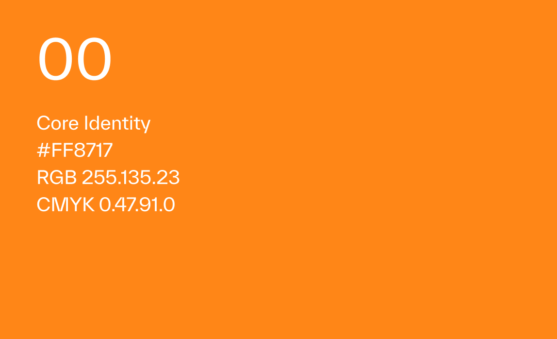
The color palette has been developed to reinforce the brand and enhance the visual identity with a color scheme that supports various needs and tasks of the brand. Additionally, it is tailored for the Ledidi core product, ensuring readability of visual elements while adhering to universal design principles. Colors categorized as 01 are primary colors, serving as the most frequently used colors in the brand. 02 represents secondary colors, offering flexibility for various elements within the brand. 03 comprises tertiary colors, predominantly used in the Ledidi Core product but flexible enough to be incorporated into the overall brand. Color 00 stands as Ledidi's main identity color.
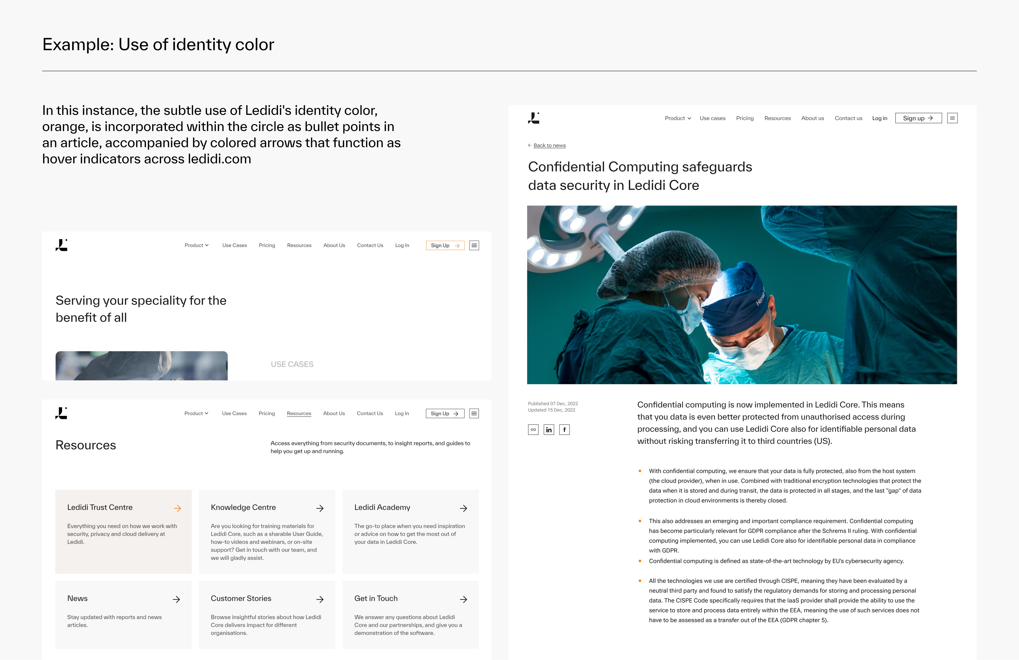
The identity color for Ledidi is orange. It should be used wisely and delicately throughout the brand. The color is predominantly featured on the small circle, which is Ledidi's brand element, symbolizing the core that is consistent throughout the entire brand.
Symbols
Ledidi is using Material Symbols with over 3,183 glyphs in a single font file with a wide range of design variants. The symbols must be used with this styling:
- Style: Outlined
- Weight: 300
- Optical size: 24dp
Downloads
Brand assets for download launching soon