Statistical Analysis and Data Visualisation
Real-time collaboration, real-time results
Use statistics and data visualisation to get real-time results. All analyses can be performed without exposing the underlying primary data. This allows you to preserve the data privacy and confidentiality of any sensitive data your dataset may contain.
Focus on asking the important questions and getting your results – statistics and graphical presentation. All the complicated structuring happens “behind the scenes”.
- Enjoy a rich repertoire of built-in descriptive and comparative statistical analyses
- Build dashboards for an easier overview
- Export your results from the analysis panel
- Share insights without giving recipient access to sensitive personal data
Ready to use
There is no need to prepare data, reorganise columns and rows, introduce grouping variables or check for missing data. The data is always ready for analysis, and there is no risk for errors to be introduced in the dataset when collaborators filter or analyse data, or export figures or tables.
All statistical analysis can be run directly on the dataset in an easy-to-use interface. In fact, the user does not need to see the underlying raw data at all to get full value of them.
Say goodbye to difficult-to-use statistical software
The Ledidi platform has a user-friendly and intuitive analysis panel that works for all collaborators. And it is safe. There is no risk of data contamination when collaborators analyse data.
Explore your data across sub-groups
You can choose to analyse the whole dataset or add filters to only analyse parts of the data. When you add filters, all analyses are re-calculated in real time.
You can filter your datasets based on categorical, numerical, date and text variables.
Ready for presentation and publication instantly
Export your results to tables, graphs and charts that can be pasted into presentations or publications. Tables are exported as CSV files, and graphics as SVG files that are fit to use on both digital and print publications.
Use the analysis panel as a presentation tool
When you perform Showing the analyses live, it is a great way to engage your audience. The raw data stays hidden.
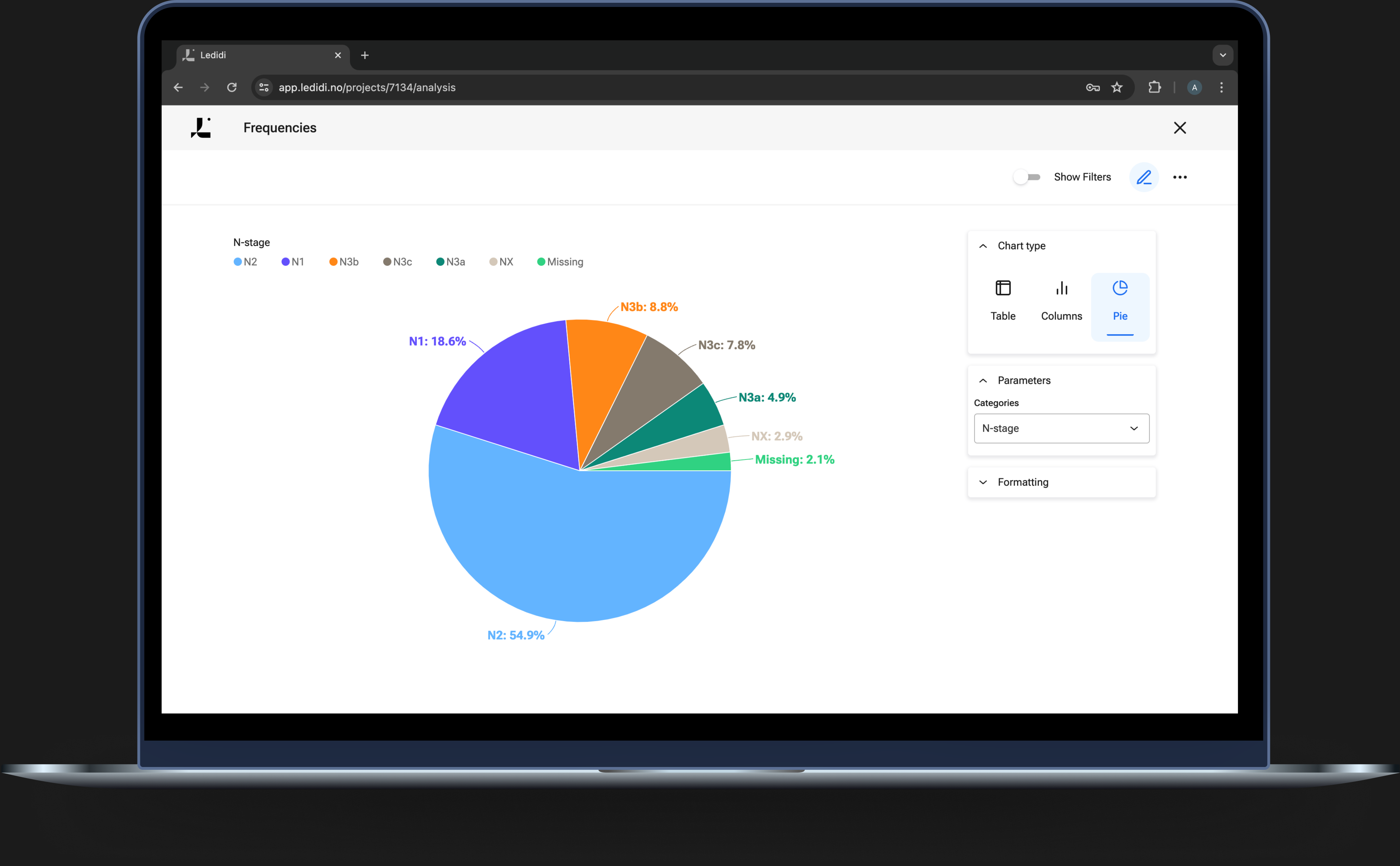
Frequencies
“Frequencies” calculates the frequencies of categorical variables.
The results can be displayed as a table, a bar chart or as a pie chart.
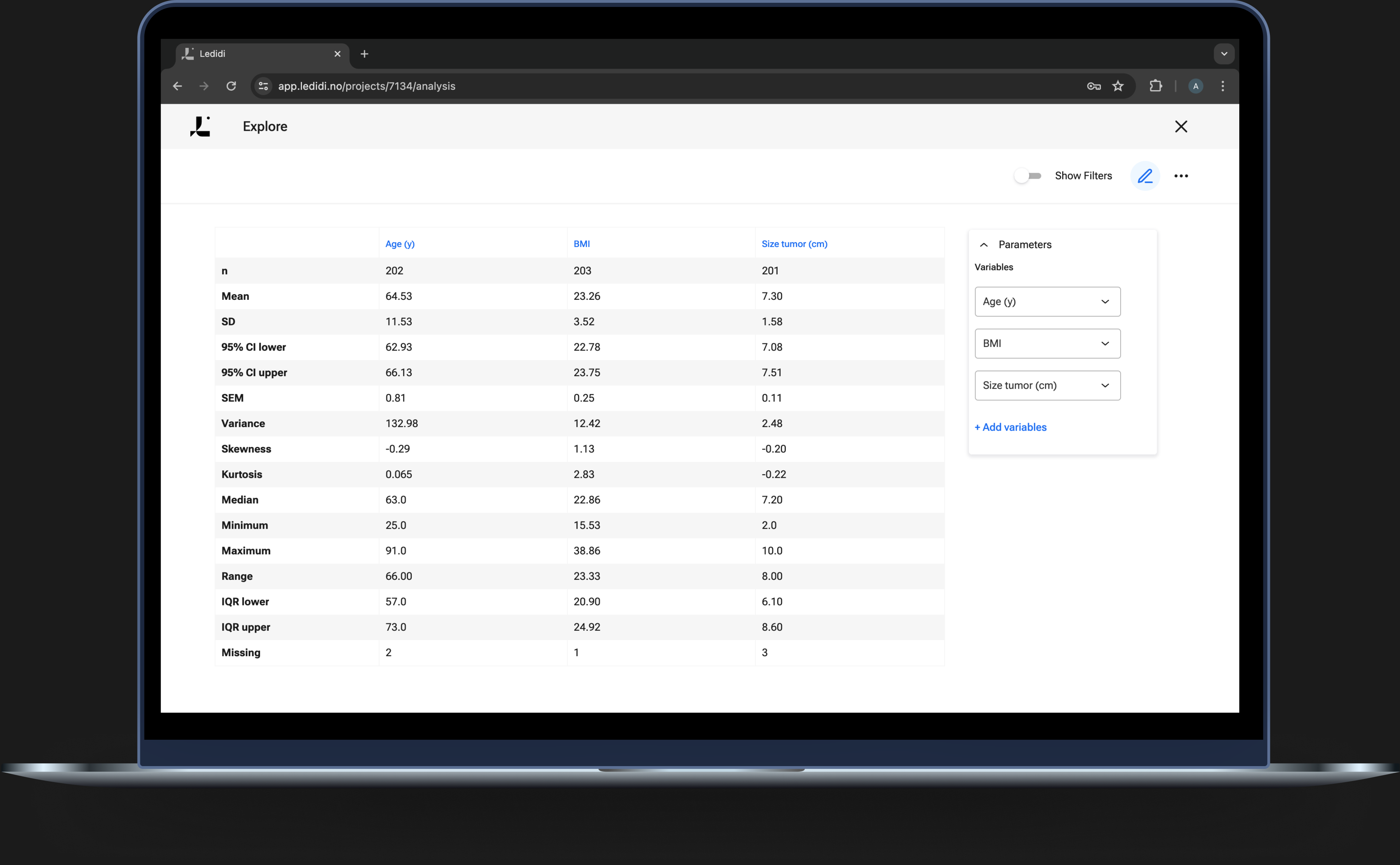
Explore
With “Explore”, you get an overview of the descriptive numerical statistics in your dataset. You can display one or more numerical variables at the same time.
The values include count, mean, standard deviation, upper and lower 95% confidence intervals, standard error, variance, skewness, kurtosis, median, minimum and maximum values, range and upper and lower quartile range.
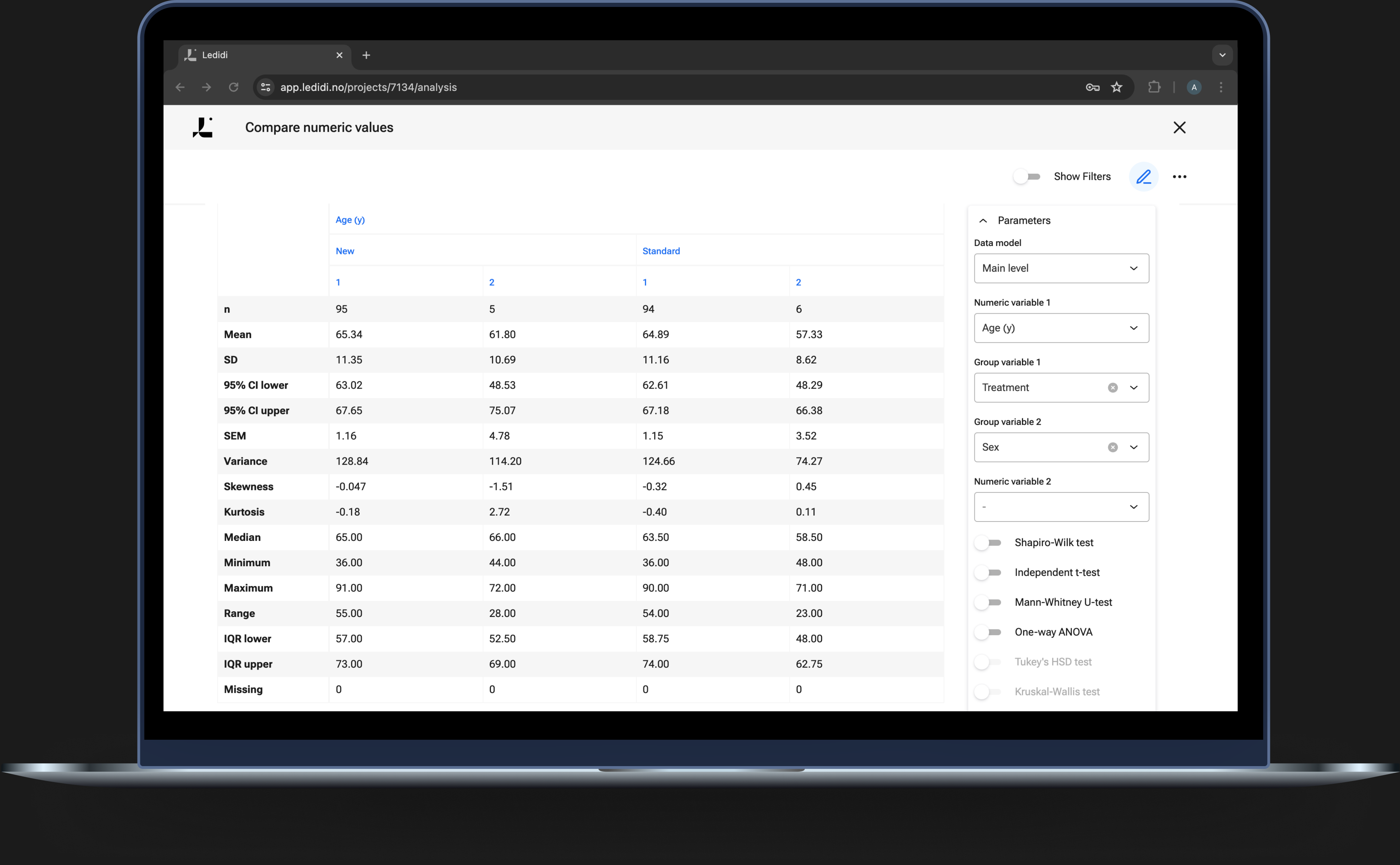
Compare numeric values
With “Compare numeric values” you can explore potential differences in numerical variables between groups.
A number of tests are available to compare differences between groups.
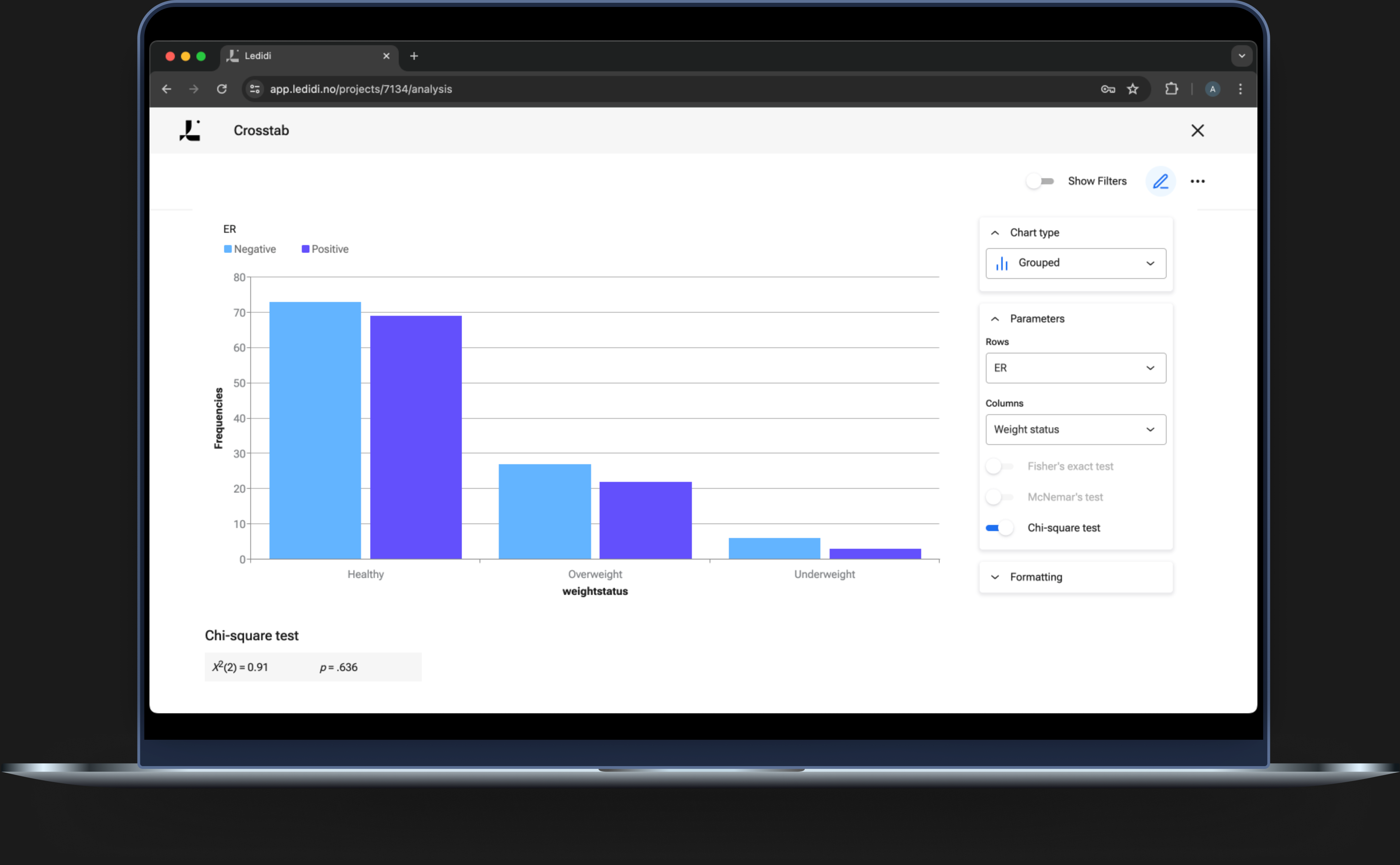
Crosstab
Cross-tabulations (“crosstab”, two-way tables, contingency tables) can be used to describe the relationship between two categorical variables.
For testing independence between categorical variables, Fisher’s exact, McNemar and Chi-square test are available.
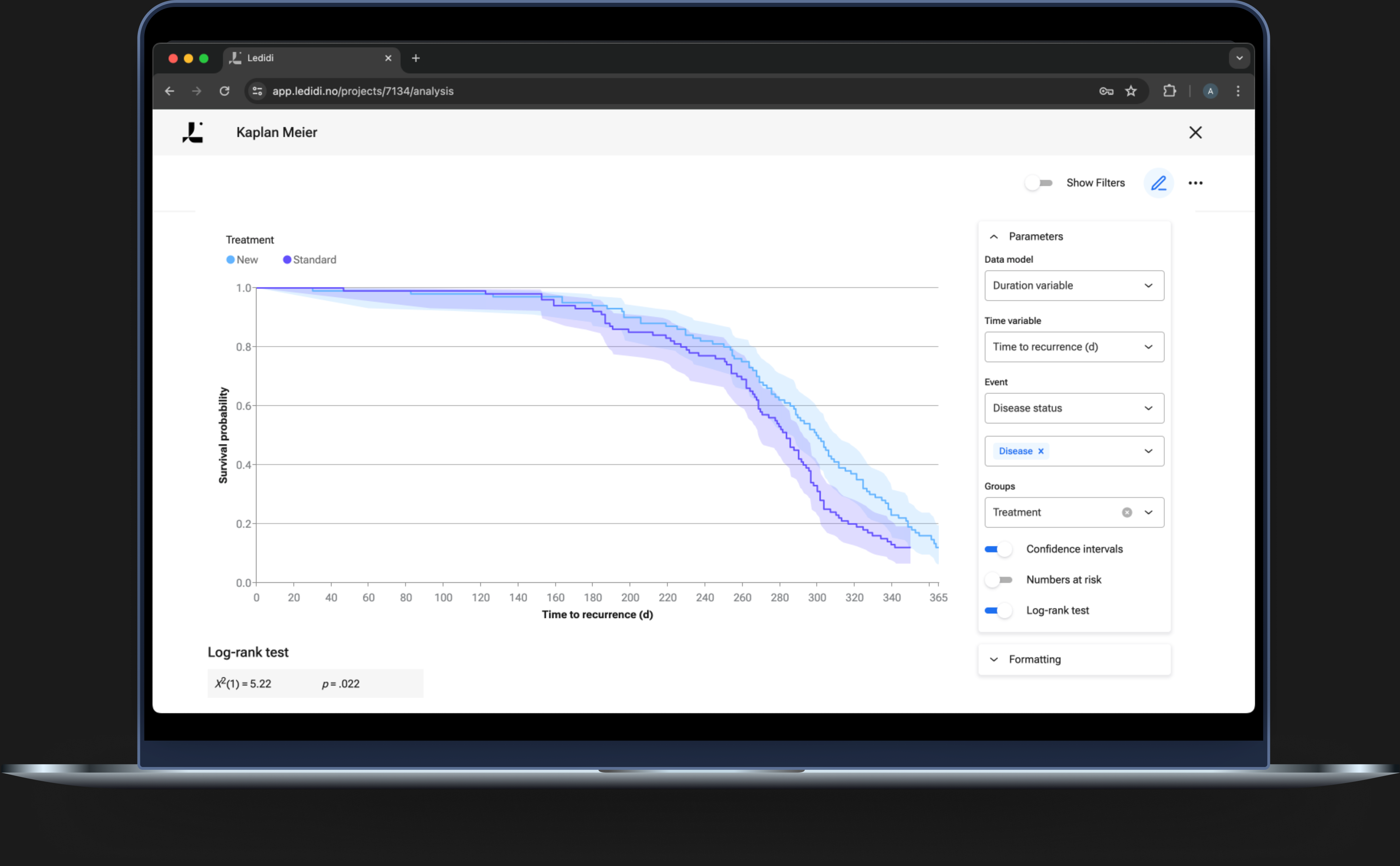
Survival curves with Kaplan Meier plot
With the Kaplan Meier survival analysis you can compare survival (or other events) between groups, visualise confidence intervals, and perform Log Rank statistical analysis. Kaplan Meier is commonly used in survival analysis, and is easy to perform in the Ledidi platform.
Confidence intervals and Numbers at risk are displayed by a click. This function also includes the log-rank test, which is a hypothesis test that compares the survival probabilities between two groups.
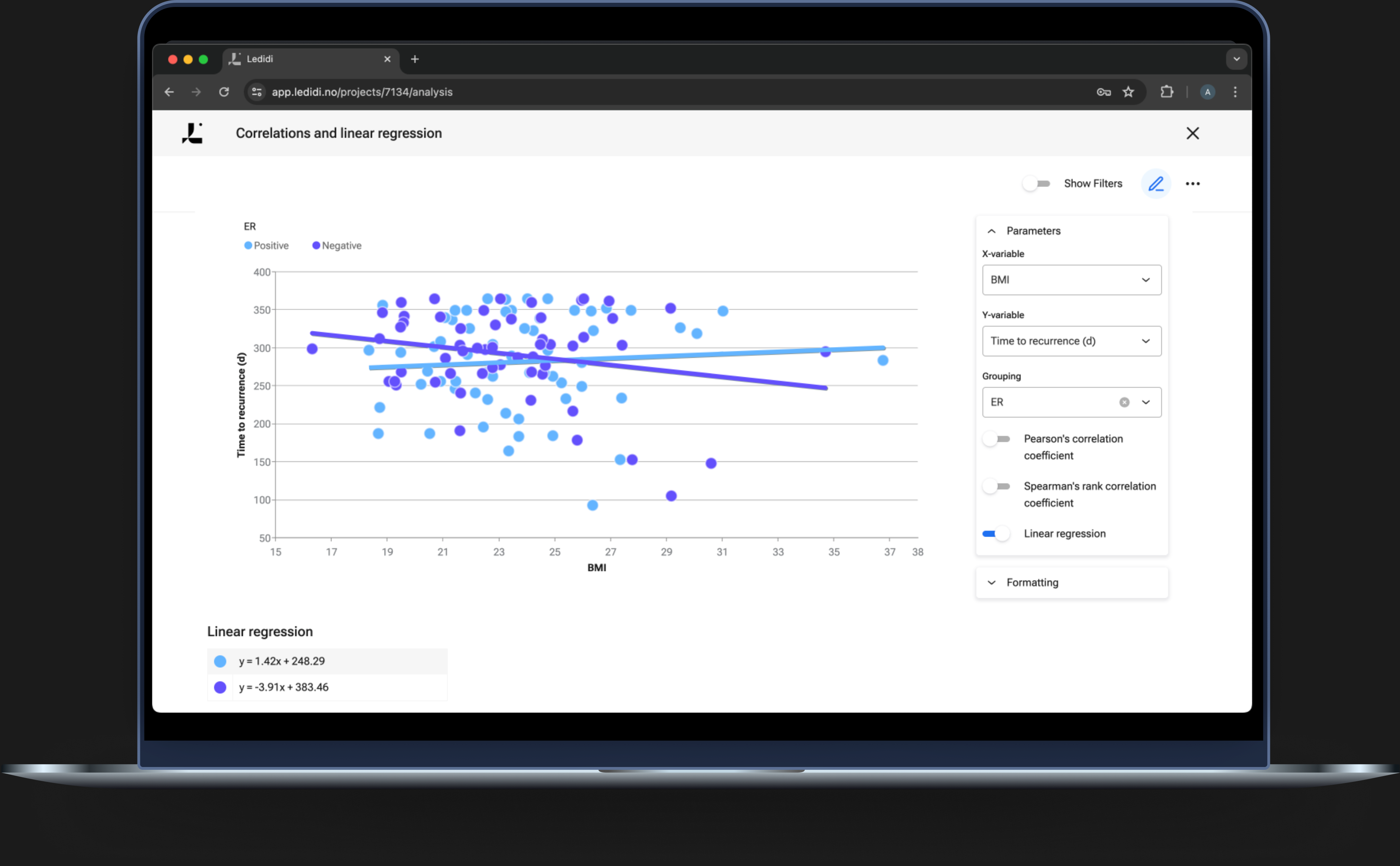
Correlations and linear regression
Correlation plots and linear regression are powerful analyses to discover relationships and associations in your data. By combining filters you can identify subsets in the dataset and discover significant associations faster than ever.
The correlation coefficients (Pearson’s and Spearman’s Rank) are available to evaluate the relationship between two continuous variables.
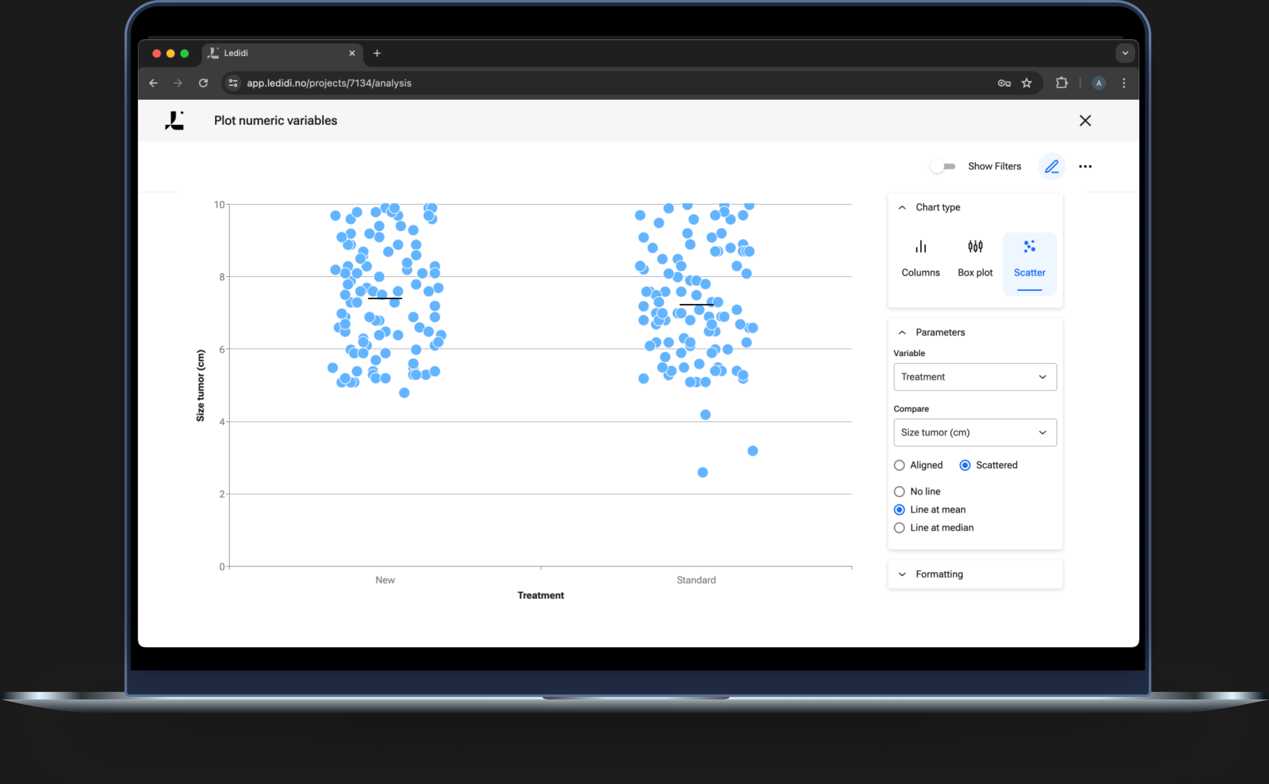
Plot numeric variables
Plot numeric variables enable you to present your numeric data graphically as columns, box plots, and scatter plots.
Range, Standard Derivation, and 95% CI can be included in your plots/graphs.
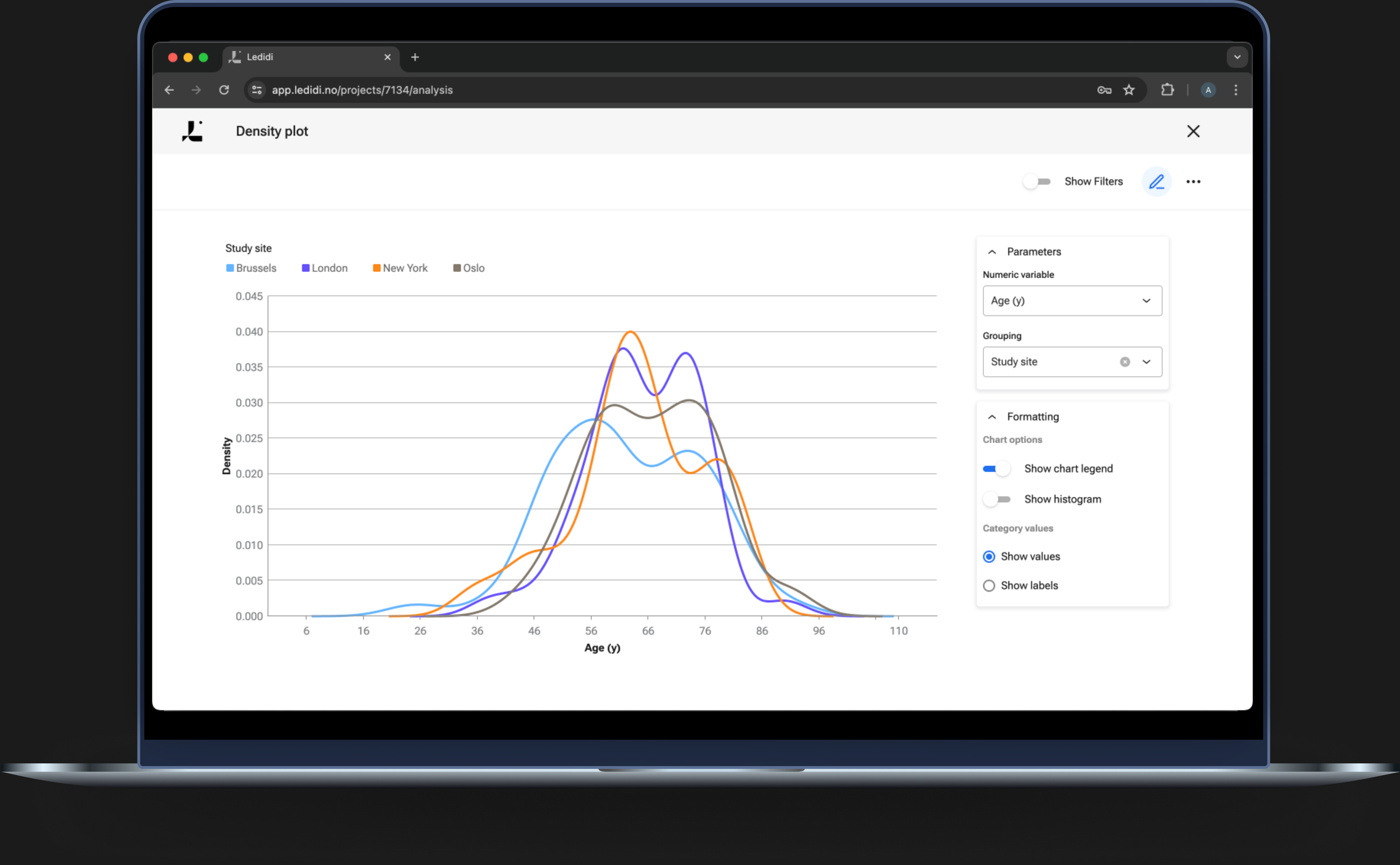
Density plot
The density plot can be easily obtained in Ledidi Core to show a representation of the distribution of a numeric variable along the x-axis.
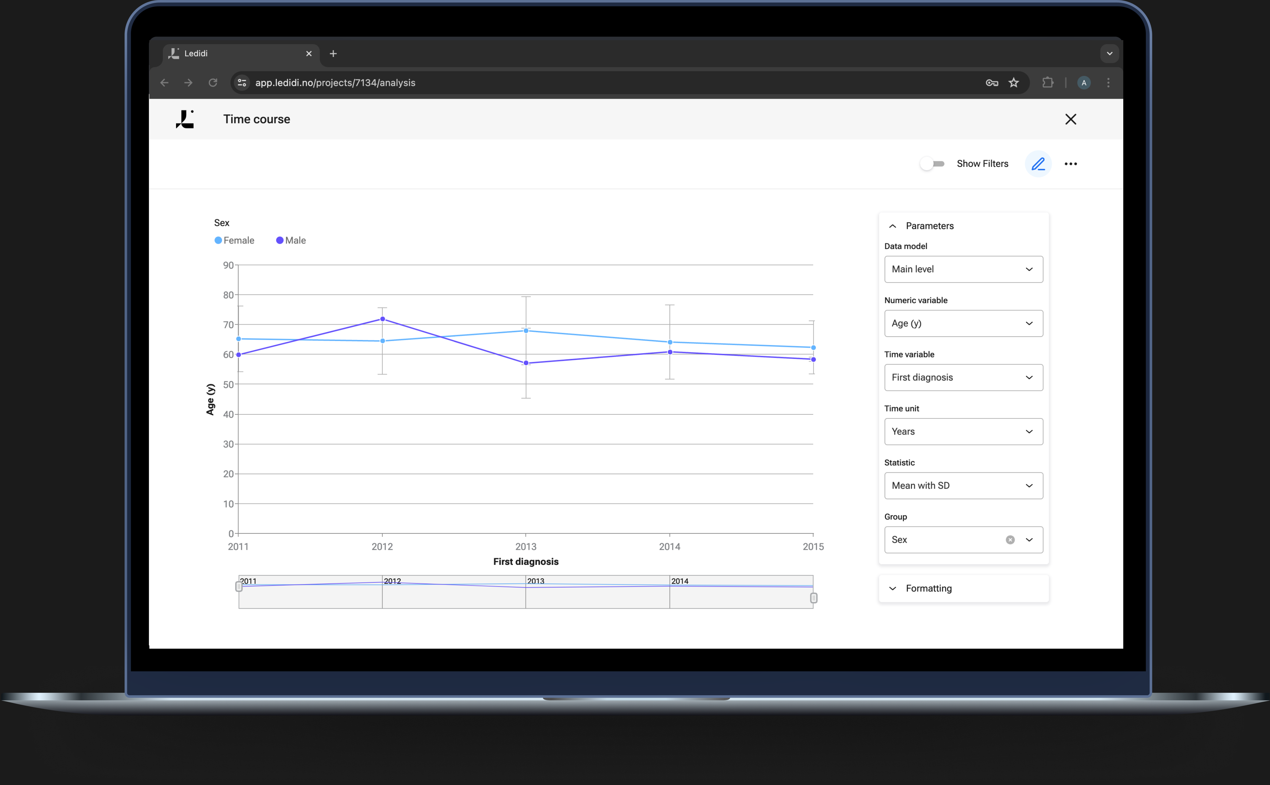
Time-course
Time-course analysis plots a time series from multiple entries where a single date variable defines the time.
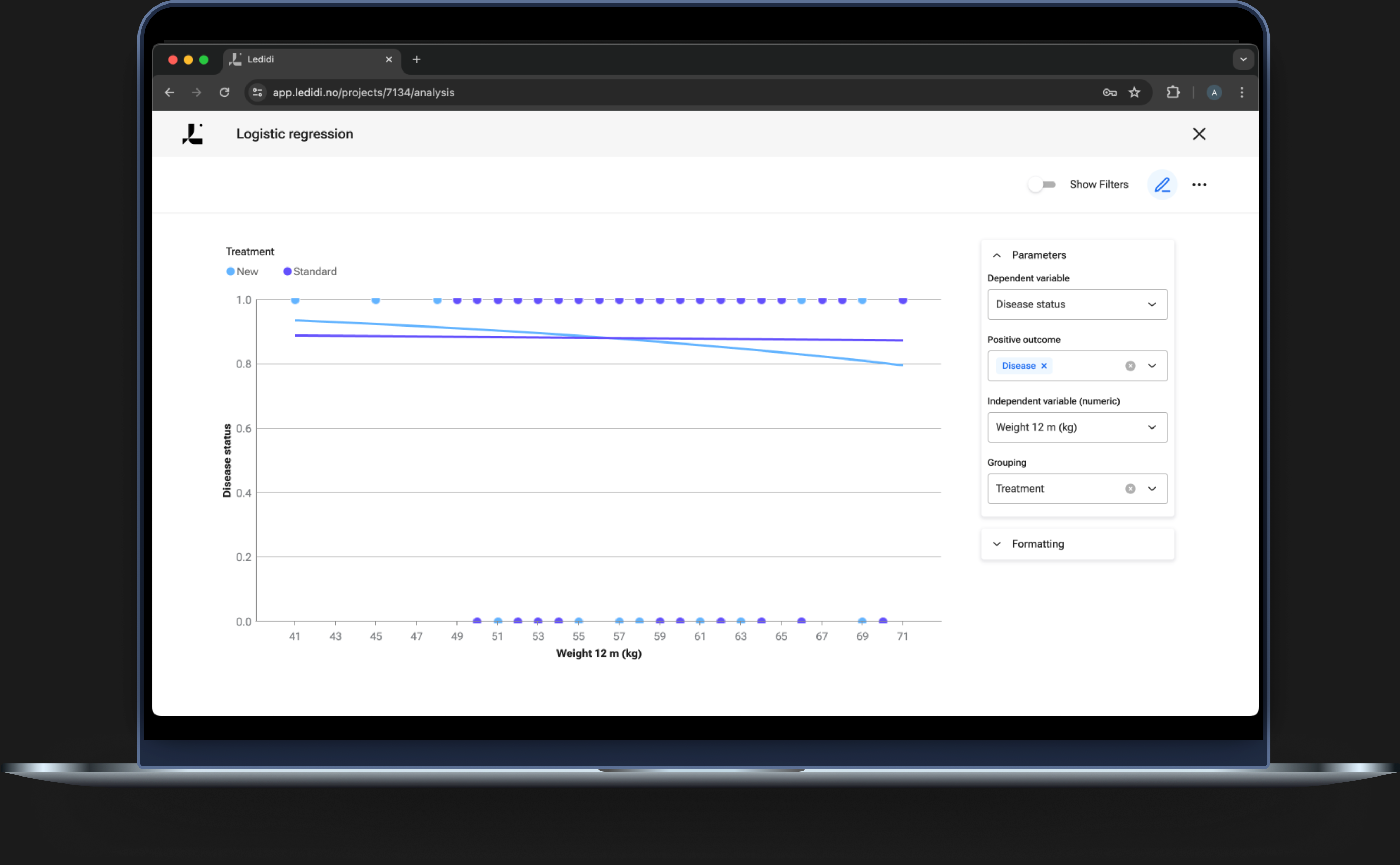
Logistic regression
Logistic regression can be used to estimate the probability of an event occurring based on a given dataset or independent variables.
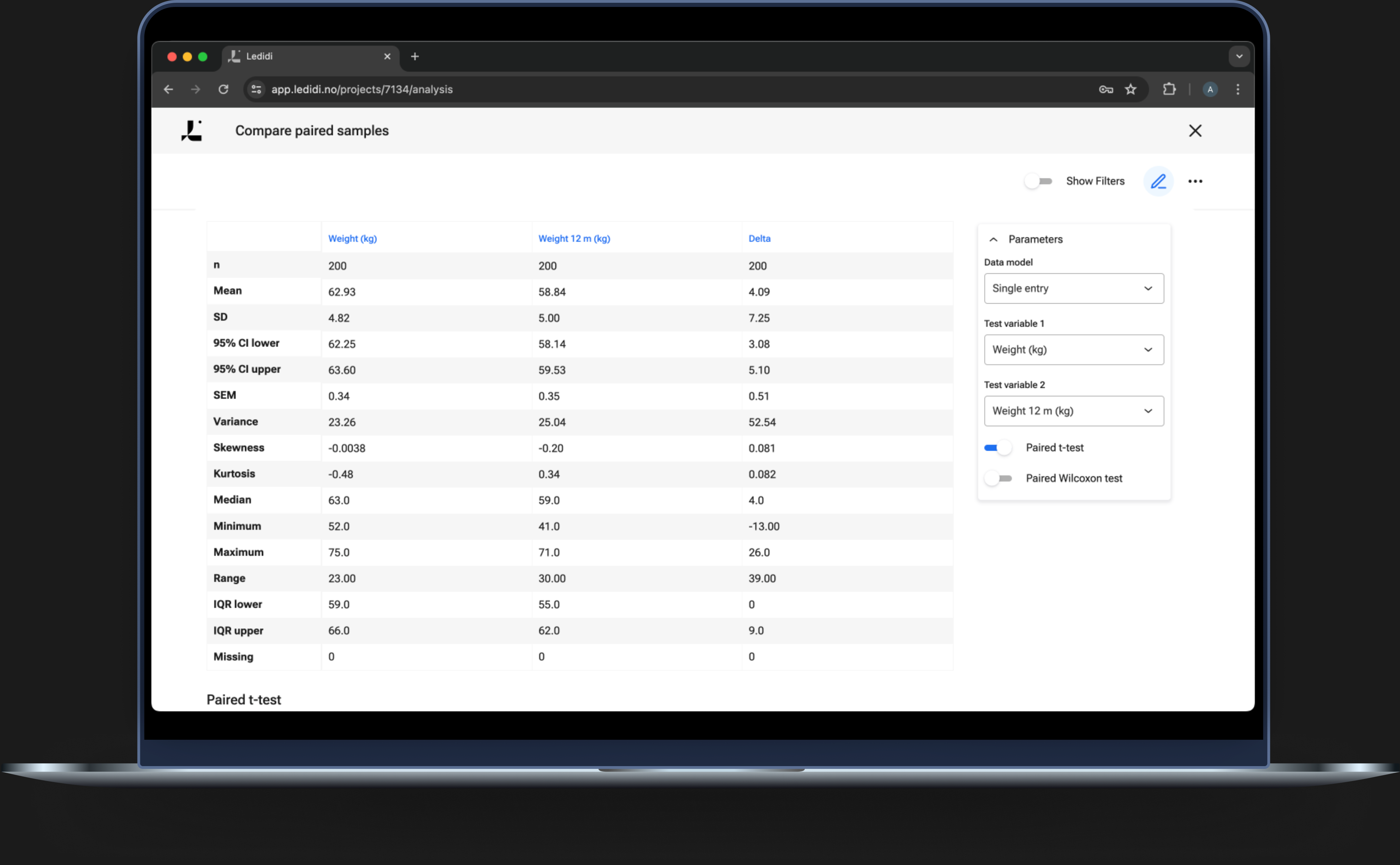
Compare paired samples
With the compare paired samples analysis, you can test potential differences in numeric variables between paired groups.
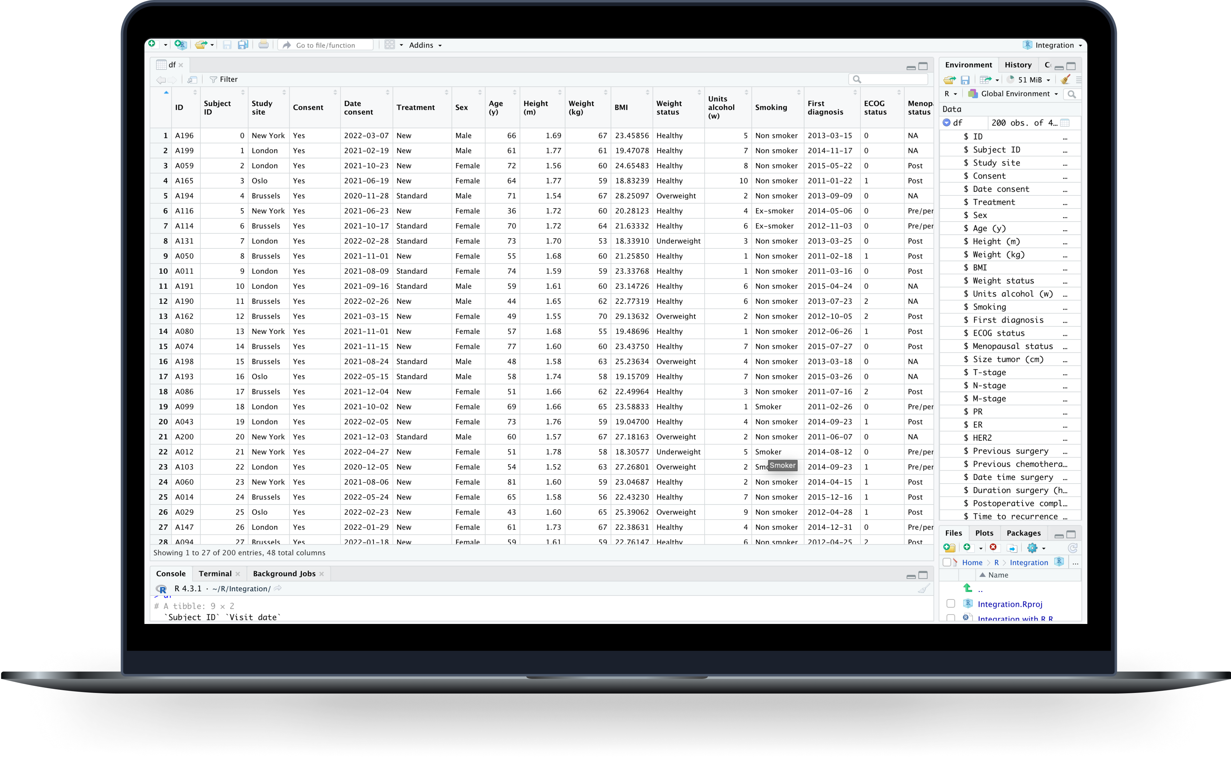
Integration with R
In need of more advanced statistics? The Ledidi platform can easily be integrated with the R software environment.